Anthropic:
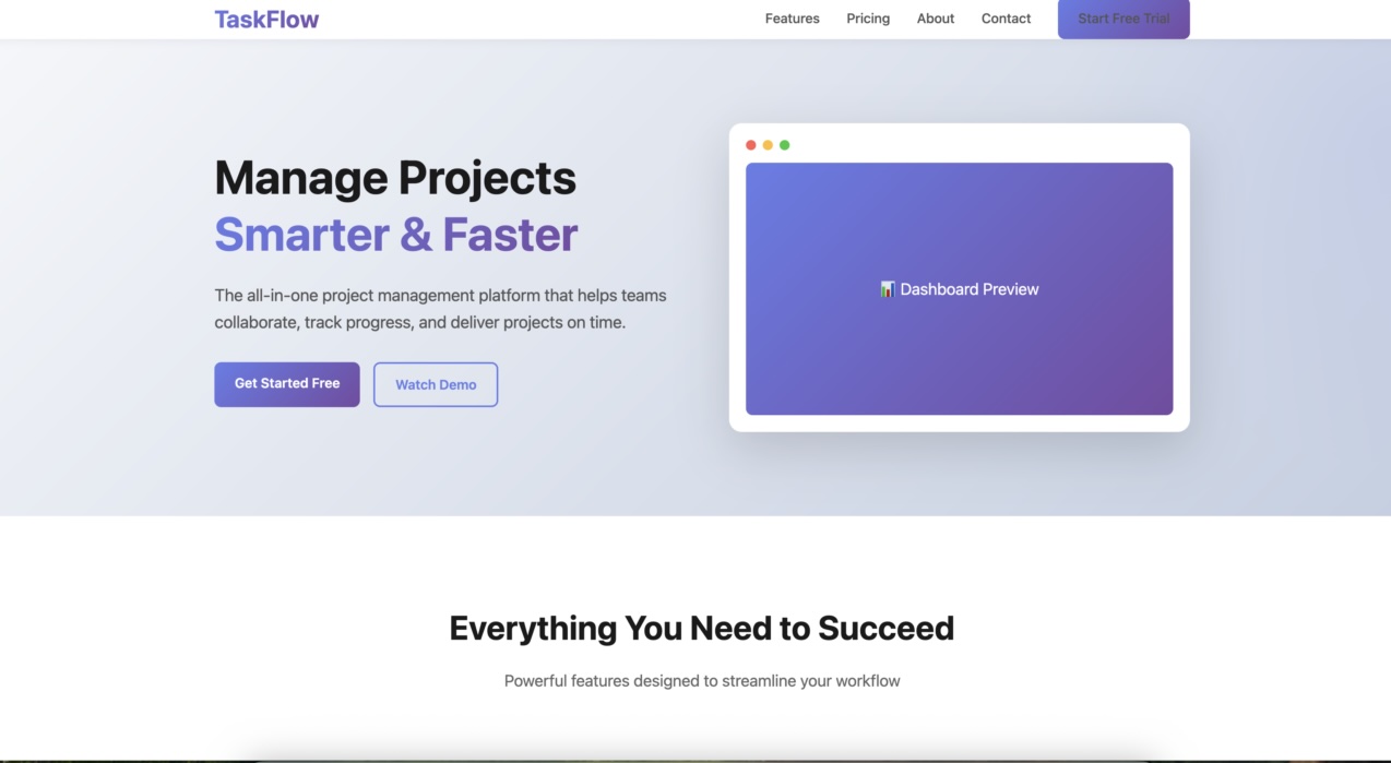
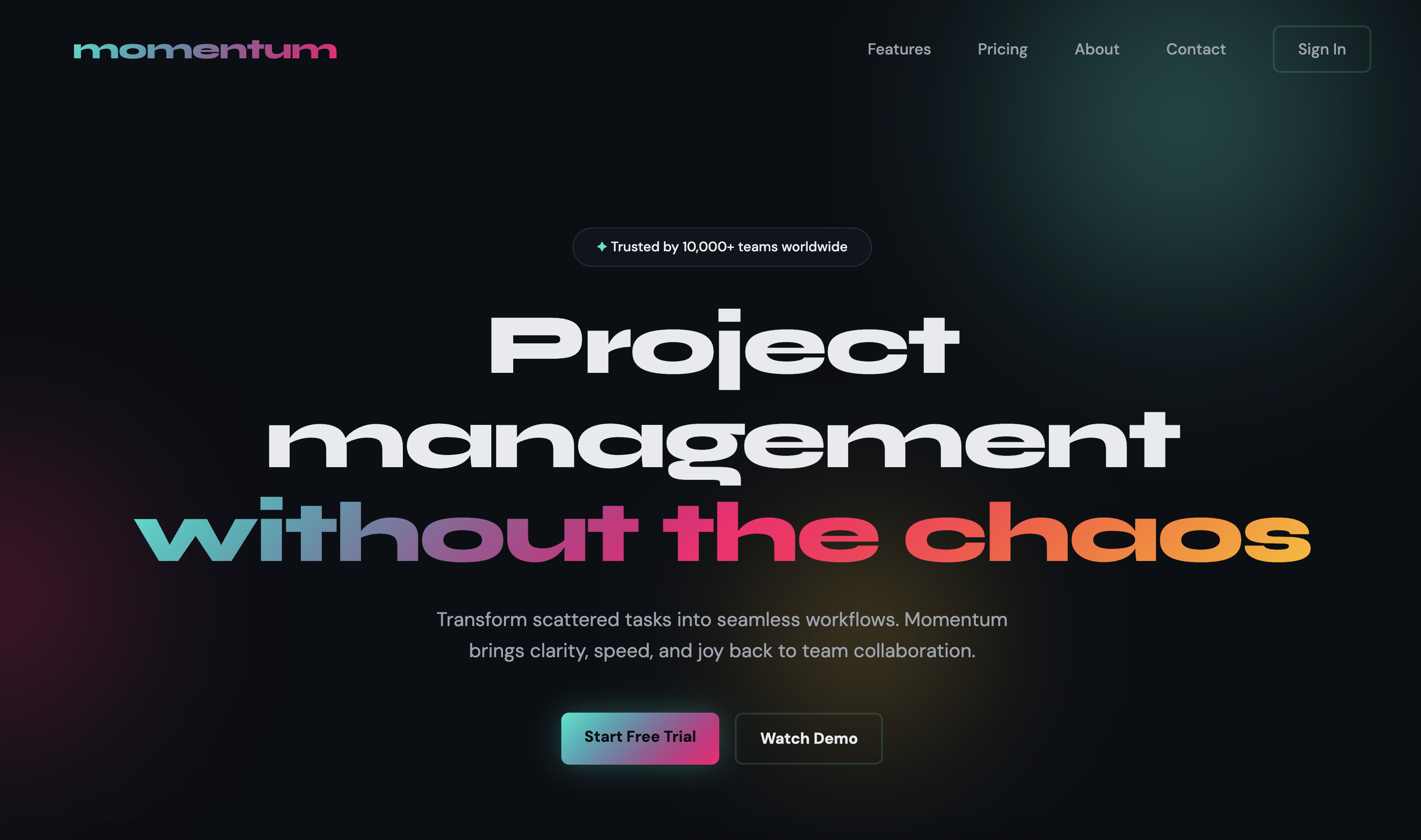
Claude can generate high-quality frontends, but without guidance it tends toward generic, conservative designs. […] Claude has strong knowledge of design principles, typography, and color theory, but defaults to safe choices unless explicitly encouraged otherwise.
Anthropic found three strategies to produce better results:
- Guide specific design dimensions
- Reference design inspirations
- Call out common defaults to avoid
With an aesthetics prompt section, the task create a SaaS landing page for a project management tool improves a lot:


This example prompt applies these strategies:
<frontend_aesthetics>
You tend to converge toward generic, “on distribution” outputs. In frontend design, this creates what users call the “AI slop” aesthetic. Avoid this: make creative, distinctive frontends that surprise and delight. Focus on:Typography: Choose fonts that are beautiful, unique, and interesting. Avoid generic fonts like Arial and Inter; opt instead for distinctive choices that elevate the frontend’s aesthetics.
Color & Theme: Commit to a cohesive aesthetic. Use CSS variables for consistency. Dominant colors with sharp accents outperform timid, evenly-distributed palettes. Draw from IDE themes and cultural aesthetics for inspiration.
Motion: Use animations for effects and micro-interactions. Prioritize CSS-only solutions for HTML. Use Motion library for React when available. Focus on high-impact moments: one well-orchestrated page load with staggered reveals (animation-delay) creates more delight than scattered micro-interactions.
Backgrounds: Create atmosphere and depth rather than defaulting to solid colors. Layer CSS gradients, use geometric patterns, or add contextual effects that match the overall aesthetic.
Avoid generic AI-generated aesthetics:
- Overused font families (Inter, Roboto, Arial, system fonts)
- Clichéd color schemes (particularly purple gradients on white backgrounds)
- Predictable layouts and component patterns
- Cookie-cutter design that lacks context-specific character
Interpret creatively and make unexpected choices that feel genuinely designed for the context. Vary between light and dark themes, different fonts, different aesthetics. You still tend to converge on common choices (Space Grotesk, for example) across generations. Avoid this: it is critical that you think outside the box!
</frontend_aesthetics>
Leave a Reply